Let’s start with the blunt truth: if your images are the wrong size on social media, you already lost half the battle. Doesn’t matter how clever the caption is, or how expensive the product looks—if the photo’s cropped wrong or stretched weirdly, people scroll past without a thought.
And the thing is, these sizes aren’t just about “pixels.” They’re about signals. A blurry cover photo whispers carelessness. A thumbnail cut off at the chin screams “amateur.” Clean, crisp, properly sized visuals? They tell the world: this person has their act together.
So Here’s Our Sure Shot Guide on Always Up-to-Date Social Media Image Sizes
Table of Contents
Why Social Media Sizes are Important
Think about the last time you walked by a shop with a crooked sign. Did you trust them with your money? Probably not. Same thing here. Social media is the storefront, and every profile photo, banner, or story dimension is basically your digital signage.
The system is invisible but relentless: platforms compress, crop, and reframe. If you don’t play by their rules, your content gets punished—not officially, but in perception. And perception is the real currency online.
Facebook: Still the Digital Town Square
Profile picture: 180 x 180 pixels
Cover photo: 820 x 312 pixels
Shared image: 1200 x 630 pixels
Event cover: 1920 x 1005 pixels
Here’s the annoying truth nobody tells you: Facebook compresses images like it’s trying to save memory for the apocalypse. If you upload just the minimum, it’ll look muddy. Always go bigger, stick to the same ratio, and let Facebook scale it down.
Imagine you’re posting a café menu. If it comes out fuzzy? People don’t think, “Oh, Facebook compressed it.” They think, “Hmm, if they can’t handle a photo, can they handle my lunch order?”
Instagram: Where Ratios Shape Identity
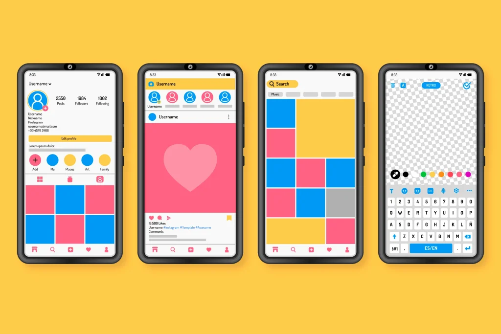
Creative by Freepik
Profile picture: 320 x 320 pixels
Square posts: 1080 x 1080 pixels
Portrait posts: 1080 x 1350 pixels
Landscape posts: 1080 x 566 pixels
Stories/Reels: 1080 x 1920 pixels
Instagram is basically architecture. Squares look neat and balanced. Portraits dominate the feed and scream pay attention to me. Stories and Reels? They fill the whole screen, which makes them intimate in a way no other format matches.
Bottom line: cropping isn’t an afterthought. It’s distribution strategy.
X (Twitter): Blink-and-You-Miss-It Billboards
Profile picture: 400 x 400 pixels
Header image: 1500 x 500 pixels
In-stream photo: 1200 x 675 pixels
X is velocity. People scroll like their thumbs are on fire. Your image is a speed bump—either it slows them down enough to read your words, or it disappears in the blur.
That 1200 x 675 image? It’s not decoration. It’s your billboard. Get it right, and your post sticks. Get it wrong, and you look like you borrowed someone else’s template. And in a place where credibility collapses in seconds, that’s a risk you can’t afford.
LinkedIn: The Corporate Stagecraft
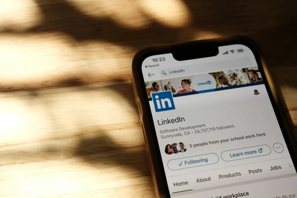
Photo by Airam Dato-on (pexels)
Profile picture: 400 x 400 pixels
Background banner: 1584 x 396 pixels
Shared image: 1200 x 627 pixels
Company logo: 300 x 300 pixels
LinkedIn is funny—it’s professional but not stiff. Your banner isn’t supposed to be loud; it’s supposed to frame who you are. A speaking gig photo, a tagline, a clean product shot—those work.
Get the sizing wrong, though, and you look sloppy. And sloppy here reads as unprofessional. That’s the quiet system behind LinkedIn: details equal competence.
TikTok: The Vertical Stage
Profile picture: 200 x 200 pixels
Videos: 1080 x 1920 pixels
TikTok doesn’t mess around. It’s vertical or bust. Upload something horizontal, and it instantly feels recycled from another platform. That alone can cut your reach in half[2].
TikTok isn’t a feed, it’s a stage. Full screen, bright lights, no distractions. If you don’t fill that space natively, you look like the understudy trying to squeeze into someone else’s costume.
YouTube: The Battle for the Click
Profile picture: 800 x 800 pixels
Channel art: 2560 x 1440 pixels (safe area: 1546 x 423)
Thumbnails: 1280 x 720 pixels
YouTube thumbnails are persuasion in a rectangle. They decide if people click—or if your masterpiece disappears into the digital abyss.
Think of it this way: every video competes against 720,000 other uploads each day. Your thumbnail is the hook. Wrong size? Wrong crop? You’ve basically hidden the bait.
Pinterest: Tall Pins Win
Profile picture: 165 x 165 pixels
Pins: 1000 x 1500 pixels (2:3 aspect ratio recommended)
Pinterest is one of those places where ratio rules. Too square, you vanish. Too tall, the platform chops it off. 2:3 is the magic formula.
And unlike Instagram, Pinterest rewards vertical content with more screen time. Each extra second someone lingers on your pin increases the chance they save or share it. Small detail, big signal.
The Larger Pattern: Respect the Container
Here’s the hidden truth: these sizes aren’t arbitrary. They’re containers, and each platform gives you one. Respect it, and your message flows. Ignore it, and you look out of place.
This is the reason “always up-to-date” guides matter. Platforms tweak their containers constantly, and what looked fine last year suddenly looks broken.
Staying Updated Without Losing Your Mind
Photo by Karolina Grabowska (Pexels)
You’ve got three options:
Bookmark the help pages of every platform (tedious but precise).
Follow blogs like Hootsuite or Sprout Social that track changes.
Or, lean on services like BuyRealFollows that bring these shifts into context of growth—because having the numbers without the application doesn’t help much.
At the end of the day, it’s not about memorizing pixels. It’s about staying fluent in the language of attention.
Quick Reference Table for Social Media Image Sizes (2025 Edition)
Platform
Profile
Cover/Header
Post
Stories/Reels/Video
Notes
Facebook
180×180
820×312
1200×630
—
Event cover: 1920×1005
Instagram
320×320
—
1080×1080 / 1080×1350
1080×1920
Portrait maximizes feed space
X (Twitter)
400×400
1500×500
1200×675
—
Heavy compression
LinkedIn
400×400
1584×396
1200×627
—
Company logos: 300×300
TikTok
200×200
—
—
1080×1920
Vertical only
YouTube
800×800
2560×1440
1280×720 (thumbnail)
—
Safe zone: 1546×423
Pinterest
165×165
—
1000×1500
—
Stick to 2:3 ratio
Why This Really Matters
Here’s the part most people miss: fixing your social media image sizes won’t make you go viral. But not fixing them guarantees you won’t.
Photo by Drazen Zigic (Freepik)
If you’re an aspiring influencer, this is your low-hanging fruit. If you’re a small brand, it’s reputation management at pixel level. And if you’re just starting out, it’s the cheapest credibility boost you’ll ever get.
Platforms evolve, standards shift, but one principle stays constant: attention flows toward clarity.
That’s why even companies like BuyRealFollows don’t just talk about growth in numbers. They care about how you show up. Because growth without trust is fragile. Growth paired with credibility? That’s where the real staying power is.
Closing Note
Nobody compliments you for uploading the right-sized banner. But everybody notices when you don’t.
It’s like ironing your shirt before a big meeting: invisible when done right, unforgettable when ignored.
So keep this image size guide handy, update it as the platforms change, and when you’re ready to go beyond visuals, check out our up-to-date video sizes guide—because the pixels may be small, but the signal is enormous.
Verified Author
Written by
Mark A . Johnson
Mark A. Johnson is a social media growth strategist and content lead at BuyRealFollows.com. With over a decade of experience in platform research and digital marketing, he helps brands and creators build real audiences on Instagram, YouTube, TikTok, Facebook, and Spotify. His work focuses on algorithm analysis, engagement mechanics, and social proof strategy. Mark writes practical, research-backed guides to help readers grow their presence with confidence.
WHAT YOU'LL LEARN IN THIS GUIDEWhat separates a safe TikTok follower provider from one that risks your accountThe five criteria every reliable TikTok follower site must meet in 2026How BuyRealFollows,…
WHAT YOU'LL LEARN IN THIS GUIDEWhy your Facebook page has no engagement and what the algorithm actually prioritizes in 2026The four specific signals Facebook uses to decide which posts to…
WHAT YOU'LL LEARN IN THIS GUIDEWhy most bought TikTok views drop or disappear within days and what causes itThe specific signals TikTok uses to validate views as real versus artificialWhat…
WHAT YOU'LL LEARN IN THIS GUIDEThe real differences between Twicsy and BuyRealFollows across follower quality, pricing, and platform coverageHow Twicsy's three-tier follower system (High-quality, Active, VIP) compares to BuyRealFollows' approachWhich…
WHAT YOU'LL LEARN IN THIS GUIDEWhat SocialWick is and how it differs from BuyRealFollows in platform scope and pricingSocialWick's 15+ platform catalog versus BuyRealFollows' focused 5-platform modelA verified pricing comparison…