Funny thing about Spotify covers. You don’t really notice them until you do. One day you’re scrolling through endless playlists, and—bam—some tiny square grabs your attention before your brain even processes the title.
That’s the whole game right there.
A Spotify playlist cover isn’t just decoration. It’s bait, it’s mood, it’s branding. It’s visual shorthand for what you’re about to hear. And in a sea of similar-looking thumbnails, the right artwork becomes a mini billboard for your vibe—and the little flag your audience rallies around.
Table of Contents
So… does the Spotify playlist cover really matter?
Short answer: absolutely.
Here’s why. Humans are wired to process visuals way faster than words. Before your eyes finish reading “Summer Vibes 2025,” your brain has already decided if the cover feels like sunburnt shoulders and sandy flip-flops—or like a design class project that went sideways. Spotify has even admitted that artwork influences what gets clicked and saved. Academic research on digital music backs that up too—art is an emotional trigger, faster than any description you’ll ever type.
So yes, you can have the best playlist on Earth, but if the cover looks like an afterthought? Good luck convincing anyone to press play.
What makes artwork “work”?
Think of it as a three-legged stool. If one leg is off, the whole thing tips.
Simplicity. It has to read clearly even when it’s shrunk to the size of a coin.
Consistency. The vibe of the art should match the playlist theme and whatever larger brand or identity you’re building.
Emotion. The best covers don’t just look good—they feel right.
Nail those, and you’re golden. Miss one, and you’re just another blurry square on someone’s screen.
The rules Spotify sets (and why you should care)
Before you get clever, you have to play by Spotify’s rules. They’re picky, but fair:
Size: 3000 x 3000 pixels
Ratio: perfect square
Format: JPEG or PNG
File under 4MB
No offensive, violent, or misleading stuff (unless you want your playlist yanked)
Sounds boring, but here’s the kicker: those restrictions actually help. By forcing you into a square, Spotify makes you strip down to what matters most. The box is a creative constraint. And constraints, oddly enough, are where the best ideas come from.
How to design something people actually click
Typography: say it loud or don’t say it at all
Photo by OVAN
Fonts have personality. Blocky sans-serifs scream confidence. Script fonts whisper intimacy. Sometimes the bravest move is to skip text altogether.
If you do use words, test them small. Shrink the cover down to thumbnail size on your phone. Can you still read it? If not, neither can anyone else.
Color: cheat codes for emotion
Colors work like cheat codes for the brain.
Reds and oranges = fire, energy, movement.
Blues and greens = chill, focus, calm.
High contrast black/white or neon = drama, edge.
You don’t need a degree in color theory. Just ask: what’s the mood of the playlist, and does this palette match it?
Imagery: skip the clichés
Generic stock photos? Forget it. People can spot those a mile away. Go for:
Candid photography that feels lived-in
Abstract textures or shapes that leave room for imagination
Illustrations you (or someone else) actually made
The best images look like they belong. Like they couldn’t be swapped out without the whole thing collapsing.
Why this isn’t just “design” but a growth strategy
Photo by nensuria (Freepik)
Here’s the bigger picture: playlist covers don’t live on Spotify alone. They get screenshot, reshared on Instagram, embedded on blogs, dropped into TikToks. Each time, they reinforce who you are—or remind people you don’t have it figured out.
This is the same system that powers social proof everywhere. On Instagram, you might buy followers or engagement through Spotify growth services to look credible in a crowded space. On Spotify, artwork does the same heavy lifting—it signals you’re worth taking seriously. Both are about trust in the blink of an eye.
The usual traps (don’t fall for them)
Jam-packed collages that blur down to mush
Fancy fonts that no human can read on mobile
A rainbow explosion of colors with no anchor
Copying Spotify’s editorial covers so closely you look like a bootleg
Artwork that looks cool but has zero connection to the songs
Each one sends a single message: “amateur hour.”
A practical framework that never fails
Here’s a simple system that works if you actually use it:
Pick three adjectives. Describe your playlist vibe in words first (e.g., raw, late-night, restless).
Translate them visually. Raw = gritty textures. Late-night = neon. Restless = sharp angles.
Lock in colors. Two or three, max. Consistency beats chaos.
Decide on words. Use text only if it adds clarity.
Shrink test. If it still works at 100×100 pixels, you’re done.
That’s it. Start abstract, end concrete.
What great Spotify playlist covers actually look like
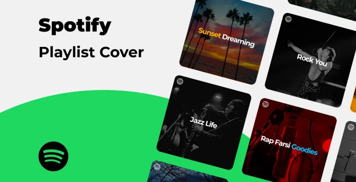
Spotify playlist cover designs
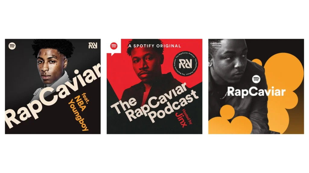
RapCaviar: big type, strong contrast. It practically punches through the screen.
Different genres, same principle: visual clarity + mood alignment = trust.
Repurposing artwork (because why stop at Spotify?)
Think beyond the platform. That same cover art can:
Announce new playlists on Instagram stories
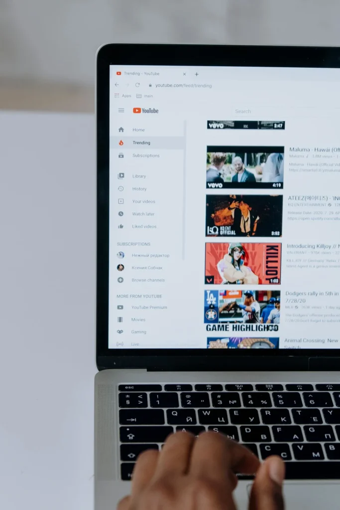
Anchor YouTube thumbnails for mixes
Show up inside TikTok clips
Photo by cottonbro studio
The repetition builds recognition. People see it once, twice, three times across different channels—and now it’s lodged in memory. That’s how you turn casual listeners into loyal ones.
Quick hits: dos and don’ts
Do
Don’t
Keep it clean
Cram in every idea you had
Match mood to music
Throw random images together
Test small sizes
Assume everyone’s on desktop
Limit palette
Explode into 20 colors
Think long-term branding
Imitate whatever’s trending
The takeaway
The perfect Spotify cover doesn’t scream for attention. It signals. It reflects the playlist so well that nothing else could fit in its place. It’s the quiet confidence of design that knows what it’s doing.
And in a world of endless noise, that kind of clarity is what gets remembered.
Verified Author
Written by
Mark A . Johnson
Mark A. Johnson is a social media growth strategist and content lead at BuyRealFollows.com. With over a decade of experience in platform research and digital marketing, he helps brands and creators build real audiences on Instagram, YouTube, TikTok, Facebook, and Spotify. His work focuses on algorithm analysis, engagement mechanics, and social proof strategy. Mark writes practical, research-backed guides to help readers grow their presence with confidence.
WHAT YOU'LL LEARN IN THIS GUIDEWhat separates a safe TikTok follower provider from one that risks your accountThe five criteria every reliable TikTok follower site must meet in 2026How BuyRealFollows,…
WHAT YOU'LL LEARN IN THIS GUIDEWhy your Facebook page has no engagement and what the algorithm actually prioritizes in 2026The four specific signals Facebook uses to decide which posts to…
WHAT YOU'LL LEARN IN THIS GUIDEWhy most bought TikTok views drop or disappear within days and what causes itThe specific signals TikTok uses to validate views as real versus artificialWhat…
WHAT YOU'LL LEARN IN THIS GUIDEThe real differences between Twicsy and BuyRealFollows across follower quality, pricing, and platform coverageHow Twicsy's three-tier follower system (High-quality, Active, VIP) compares to BuyRealFollows' approachWhich…
WHAT YOU'LL LEARN IN THIS GUIDEWhat SocialWick is and how it differs from BuyRealFollows in platform scope and pricingSocialWick's 15+ platform catalog versus BuyRealFollows' focused 5-platform modelA verified pricing comparison…